Archive for October, 2013

Surfing: How big is that wave?

From an old issue of Status magazine, this first spread is a smart way to indicate the relative height of a wave by comparing it to a 6-story building, a tree, and person holding an umbrella—well you don’t want to get wet with all this surf everywhere do you?

There’s another comparison on the right side of the second spread that references Japanese artists Hokusai’s famous wave painting.

If you want to see some truly awe-inspiring extreme sport, search for videos of the surfers at Cortez Bank.
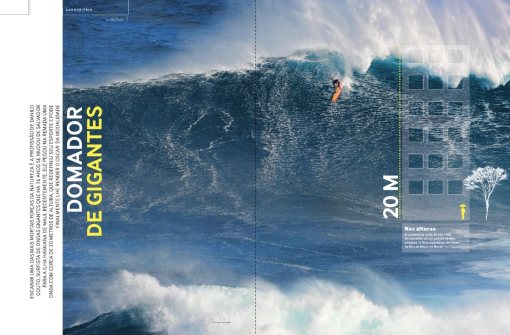
status-2011-05_0001
status-2011-05_0002

You say you want a revolution?

Argentine-Revolution-Malbec-2010-0001
Argentine-Revolution-Malbec-2010-0002

Numéro deux

Marie Claire’s French edition publish an accessories issue which they call “2.”

Inside the magazine they have some fun with the numeral.

marie claire 2-2013-AW accessories marie claire 2-2013-spring

Who’s at risk?

This graphic, designed for Bloomberg Businessweek, sets out to demonstrate the connectedness and the risk of the major financial institutions who were at the heart of the stock market collapse in September 2008.

The preponderance of arrows pointing to insurance giant AIG, show that all the banks were at risk if AIG failed. The longer the line, the greater the risk.

Counterparty business week-2013-09-16

Masthead mastery

When was the last time you looked at the masthead of a magazine: That list of names typically starting with the editor. This page, from Elle, is a brilliant attempt at creating typography that is both engaging and well-organized. It certainly made me look twice.masthead page elle-uk-2013-10

New York Times magazine: The Writer’s Room

T-NYT-2013-09
One of a number of magazine spreads illustrating the rooms where authors write.