Posts Tagged ‘ information graphic ’

The price of life

the price of life wired-2014-08

Wired, August 2014
Creative director: Billy Sorentino
Design director: Caleb Bennett

This graphic shows the amount of money the National Institutes of Health spends on ten medical conditions such as heart disease and cancer, and compares that information with the the number of deaths from those same conditions.

Not a sweet story. The facts of diabetes

Not-A-Sweet-Story

Johns Hopkins Medicine Global Collaborative Healthcare. Summer 2014
Creative director: Max Boam
Designers: Abby Ferretti, Lori Kirkpatrick

For this graphic, Abby and Lori explored many ideas in both sketches and quick computer renderings, but ultimately building the graphic in real space using the sugar-coated M&M’s—or Smarties as they are called in my place of birth—yielded the most interesting and often frustrating result.

Abby spent considerable time in the grocery story sorting out all the color options.

We found we had too few gold coins when it came to stacking up the amount of money spent in North America and we resorted to Photoshop to complete the picture once the photograph was taken.

Each candy represents 2 million diabetes cases. Each coin represents $1 billion spent on the cost of care in that geographic region.

World Beat

World-Beat-Billboard140513
billboard-2014-05-13
Billboard May 13, 2014
Creative director: Shanti Marlar
Design director: Rob Hewitt
Art director: Frank Augugliaro
Illustrator: Raymond Biesinger

Billboard graphs music sales

This clever graphic from the December 14th issue of Billboard nicely charts the relative increase in sales of songs over a three-week period. The big winner is Demi Lovato’s song from the movie Frozen.

While the graphic clearly shows percentage growth, it does not indicate sales volume comparatively. For this you need to see the footnote.

[click image twice to read the text ]

graphic-billboard-2013-12-14

Who’s at risk?

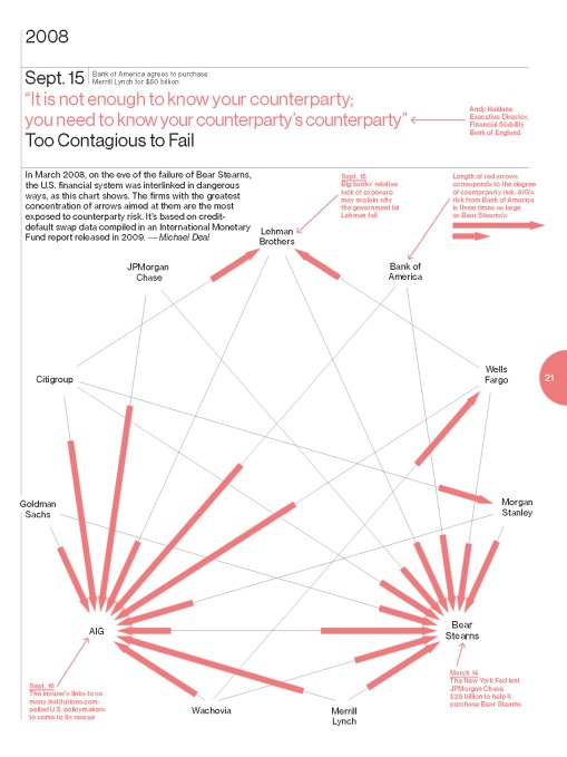
This graphic, designed for Bloomberg Businessweek, sets out to demonstrate the connectedness and the risk of the major financial institutions who were at the heart of the stock market collapse in September 2008.

The preponderance of arrows pointing to insurance giant AIG, show that all the banks were at risk if AIG failed. The longer the line, the greater the risk.

Counterparty business week-2013-09-16

Kickstarter: Data visualized

Three graphics in detail, from the spreads posted here.
Design group: Catalogtree. Watch a video about data visualization here.

What-kickstarter-has-kickstarted-fast-company-2013-04-Ben-Stiller_Page_1

Whats-Popluar-kickstarter-fast-company-2013-04

Most-Launched-locations-kickstarter-fast-company-2013-04

Multitasker or unproductive time waster?

As a self-proclaimed monotasker, I thorougly enjoyed reading this article from the March issue of Harvard Business Review, that carefully plots the work day productivity of two very different employees.

multitasking harvard business review-2013-03 advertising that works_Page_2
[click the graphic twice to enlarge]

If you’ve read Julie Morgenstern’s book, Never Check e-mail in the Morning, you’ll notice how the more productive worker follows this advice, barely checking email at all.

Another tip from Morgenstern’s book is to spend the first hour (or two if you can) of your work day on your most difficult task, you will find yourself being far more productive, than leaving that same task to the end of the day. I can attest to this. It really does work.

And one final thought on this topic of productivity is my favorite definition of email:
Someone else managing your time.

How many lawyers does it take…?

This informative graphic design from Bloomberg Businessweek does a fine job of showing the structure of the U.S. Congress and the professions of those elected to serve us there.

[Click the graphic to enlarge]
Bloomberg Businessweek 14-20 January 2013-The congress