Archive for the ‘ information graphics ’ Category

The price of life

the price of life wired-2014-08

Wired, August 2014
Creative director: Billy Sorentino
Design director: Caleb Bennett

This graphic shows the amount of money the National Institutes of Health spends on ten medical conditions such as heart disease and cancer, and compares that information with the the number of deaths from those same conditions.

Not a sweet story. The facts of diabetes

Not-A-Sweet-Story

Johns Hopkins Medicine Global Collaborative Healthcare. Summer 2014
Creative director: Max Boam
Designers: Abby Ferretti, Lori Kirkpatrick

For this graphic, Abby and Lori explored many ideas in both sketches and quick computer renderings, but ultimately building the graphic in real space using the sugar-coated M&M’s—or Smarties as they are called in my place of birth—yielded the most interesting and often frustrating result.

Abby spent considerable time in the grocery story sorting out all the color options.

We found we had too few gold coins when it came to stacking up the amount of money spent in North America and we resorted to Photoshop to complete the picture once the photograph was taken.

Each candy represents 2 million diabetes cases. Each coin represents $1 billion spent on the cost of care in that geographic region.

World Beat

World-Beat-Billboard140513
billboard-2014-05-13
Billboard May 13, 2014
Creative director: Shanti Marlar
Design director: Rob Hewitt
Art director: Frank Augugliaro
Illustrator: Raymond Biesinger

Billboard graphs music sales

This clever graphic from the December 14th issue of Billboard nicely charts the relative increase in sales of songs over a three-week period. The big winner is Demi Lovato’s song from the movie Frozen.

While the graphic clearly shows percentage growth, it does not indicate sales volume comparatively. For this you need to see the footnote.

[click image twice to read the text ]

graphic-billboard-2013-12-14

Surfing: How big is that wave?

From an old issue of Status magazine, this first spread is a smart way to indicate the relative height of a wave by comparing it to a 6-story building, a tree, and person holding an umbrella—well you don’t want to get wet with all this surf everywhere do you?

There’s another comparison on the right side of the second spread that references Japanese artists Hokusai’s famous wave painting.

If you want to see some truly awe-inspiring extreme sport, search for videos of the surfers at Cortez Bank.

status-2011-05_0001
status-2011-05_0002

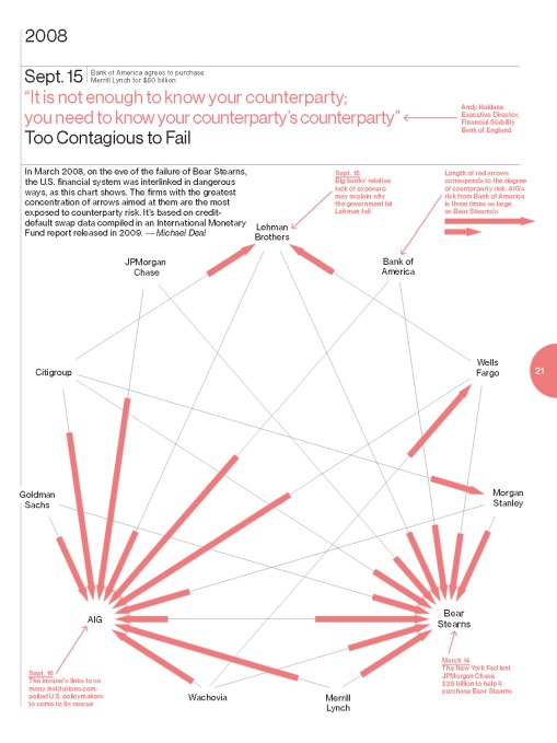
Who’s at risk?

This graphic, designed for Bloomberg Businessweek, sets out to demonstrate the connectedness and the risk of the major financial institutions who were at the heart of the stock market collapse in September 2008.

The preponderance of arrows pointing to insurance giant AIG, show that all the banks were at risk if AIG failed. The longer the line, the greater the risk.

Counterparty business week-2013-09-16

Masthead mastery

When was the last time you looked at the masthead of a magazine: That list of names typically starting with the editor. This page, from Elle, is a brilliant attempt at creating typography that is both engaging and well-organized. It certainly made me look twice.masthead page elle-uk-2013-10

Disinformation graphics

Pretty. But would you spend the time trying to unscramble this?

flight-delays-wired-2013-07s

[Click to enlarge]

Kickstarter: Data visualized

Three graphics in detail, from the spreads posted here.
Design group: Catalogtree. Watch a video about data visualization here.

What-kickstarter-has-kickstarted-fast-company-2013-04-Ben-Stiller_Page_1

Whats-Popluar-kickstarter-fast-company-2013-04

Most-Launched-locations-kickstarter-fast-company-2013-04

Fast Company April 2013

Fast-Company-2013-04-001

Fast-Company-2013-04-002

Fast-Company-2013-04-003

Fast-Company-2013-04-004

Fast-Company-2013-04-005

Fast-Company-2013-04-006

Fast-Company-2013-04-007

Fast-Company-2013-04-008

Fast-Company-2013-04-009
Fast-Company-2013-04-010

Fast-Company-2013-04-011