Posts Tagged ‘ graphic design ’

Find what’s interesting

Wired-August_2014_features

Wired-August_2014_contents

Wired, August 2014
Design director: Caleb Bennett
Senior art director: Dylan Boelte
Managing art director: Victor Krummenacher
Art directors: Allie Fisher, Joseph Reyes

I’ve always been fascinated by how graphic designers approach the task of getting magazine readers to the pages they are interested in. These two examples show great energy. The features page, top, relies on geometric shapes and a sort of tangram puzzle idea, while the contents page utilizes an organized frenzy of small images and typographic rules.

Sand strong

Golf digest-2014-06
Golf Digest, June 2014
Creative director: Ken DeLago
Art director: Tim Oliver
Deputy art director: Riva Schwartz

Music and type

Music magazine, typography, graphic design

inside

From BBC’s Music magazine, a somewhat halfhearted attempt at emulating the posters of the industrial revolution? Or just a simple typographic cover?

Harpers Bazaar: Avedon tribute

HB-2013-12-AvedonThe visual correspondence created by reflecting the detail in the sunglasses with the called out type just makes one smile.

Who’s at risk?

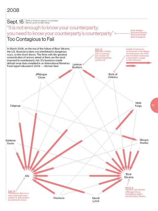
This graphic, designed for Bloomberg Businessweek, sets out to demonstrate the connectedness and the risk of the major financial institutions who were at the heart of the stock market collapse in September 2008.

The preponderance of arrows pointing to insurance giant AIG, show that all the banks were at risk if AIG failed. The longer the line, the greater the risk.

Counterparty business week-2013-09-16

Masthead mastery

When was the last time you looked at the masthead of a magazine: That list of names typically starting with the editor. This page, from Elle, is a brilliant attempt at creating typography that is both engaging and well-organized. It certainly made me look twice.masthead page elle-uk-2013-10

New York Times magazine: The Writer’s Room

T-NYT-2013-09
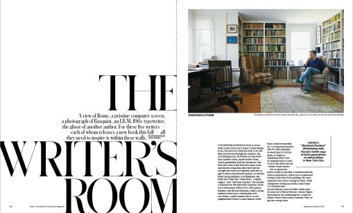
One of a number of magazine spreads illustrating the rooms where authors write.

Disinformation graphics

Pretty. But would you spend the time trying to unscramble this?

flight-delays-wired-2013-07s

[Click to enlarge]

Wired, April 2013

Wired-2013-04-1

Wired-2013-04-2

Wired-2013-04-3

Wired-2013-04-4

Wired-2013-04-5

Wired-2013-04-6

Wired-2013-04-7

The danger of data

One of the tasks of a graphic designer is to clarify information, especially complex information. And as data grows, the role of the designer becomes increasingly important. Trying to make sense of data and do it in a way that it advances learning, rather than just creating more eye candy is critical. And believe me, with the holidays now just starting, the last thing I need is more eye candy.

IBM have a website, many eyes, that they call an experiment. You can enter search terms and find categories such as brand, and a number of data sets pop up that you can visualize in different ways. Below is an example of car brands visualized by peak price point. Now it doesn’t take a genius to realize that a Maserati is NOT priced at the same price point as a BMW, but the graphic would tell you otherwise.

So what is the value of this tool if the source data is incorrect. Oh, and by the way, the data source  is not cited.

It comes back to that rather tired , but increasingly apt adage, check the source. Although something is on the web, and it looks authoritative, and in this case is even backed by Big Blue itself, well it doesn’t mean anything.

Don’t believe everything you read … or see.