Graphic design and typography
Posts Tagged ‘ advertising ’
Not the usual sports metaphor
Johns Hopkins Hospital, for whom I work, were just awarded USNews and World Report‘s best hospital in the USA award for the 21st year in a row. Not bad eh?
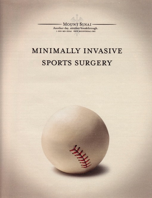
That said, I wish I had come up with this brilliant idea to advertise sports surgery which was devised for Mount Sinai Medical Center and placed in the New York Times in 2008.
An oldie but goodie.
Wait… it’s on the tip of my tongue
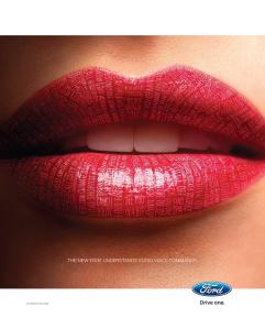
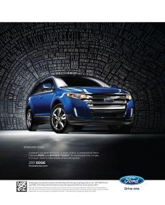
Visually arresting ads for Ford’s Edge. These ads ran as single pages on consecutive spreads.
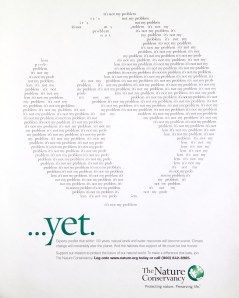
A simple premise, supported by strong visuals that reinforce the idea and something I’ve not seen before. This one really has to be enlarged to get the point.
This is particularly appropriate in Maryland because legislation comes into effect in October requiring hands-free phone communication.
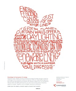
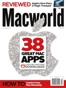
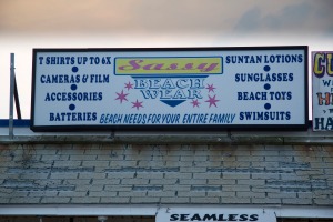
Enough typefaces?
It must have been like this during the Industrial Revolution when the guiding principle appeared to be to use as many typefaces as possible in order to stand out from your competitors.
This sign is next to the one in the previous post. You can see that just to the right.
I was unaware of the word seamless when I took this photo. However it would not be the word I’d use to describe the design.
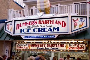
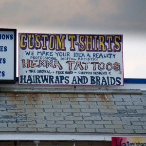
Just a sign
The boardwalk at Ocean City, Maryland. A typophile’s dream. This will be the first of several posts. I like this sign because the store owner dispensed with the traditional sign and had the entire sign painted with a brush, freehand. There are references to typefaces, the first line is a slab serif of some sort, and the last line has serifs with rounded brackets, but I don’t think this is any particular typeface.
Notice the third line: professional digital artistry.
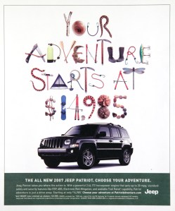
Type that’s not type: Your adventure starts at how much?
Crack open the garage door to your gas guzzling SUV and drive it to the outback where you can set up camp and watch snakes. I think there are three in this advertisement for Jeep … plus a lizard for good measure.
Unlike most illustrated typefaces where only one solution is used for each letter, you’ll see three solutions for the letter A. Nicely done.
| M | T | W | T | F | S | S |
|---|---|---|---|---|---|---|
| 1 | 2 | 3 | 4 | 5 | 6 | 7 |
| 8 | 9 | 10 | 11 | 12 | 13 | 14 |
| 15 | 16 | 17 | 18 | 19 | 20 | 21 |
| 22 | 23 | 24 | 25 | 26 | 27 | 28 |
| 29 | 30 | |||||
