The art of bigotry

^ Illustrator: David Plunkert

^ Illustrator: Edel Rodriguez

Posts Tagged ‘ illustration ’
^ Illustrator: David Plunkert
^ Illustrator: Edel Rodriguez


Entertainment Weekly July 25, 2014
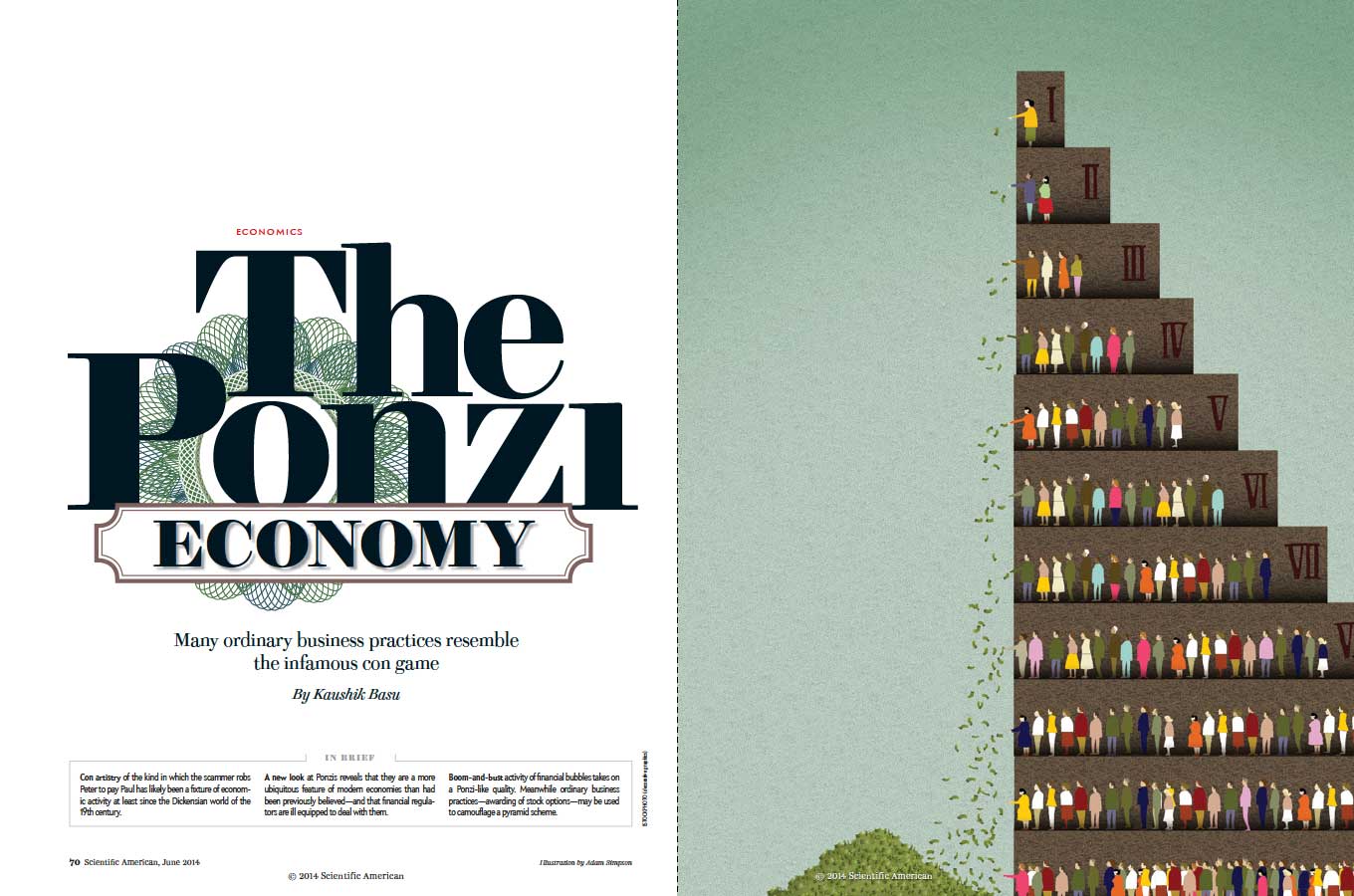

Scientific American. June 2014
Design director: Michael Mrak
Art director: Jason Mischka
Illustrator: Adam Simpson
The treatment of the typography initially caught my eye. the notion of finance is immediately conveyed in the treatment of the engraved bank note pattern, particularly the drop cap T on the second spread. The illustration showing people throwing their money away rounds out the graphic design of this feature.
Evidently the man Carlo Ponzi spent time in prison prior to his now famous money-making scheme. He explained the prison address in letters to his Italian mother by writing to her that he had a wonderful job as a “special assistant” to a prison warden.

Bloomberg Markets, June 2014
Creative director: Siung Tjia
Senior art director: Lou Vega
Managing art director: John Genzo
Photographer: Sebastian Meyer


More April 2014
Illustrations: Christopher Silas Neal
I recently watched a video of musician Imogen Heap at Wired 2012, where she explained how technology developed at MIT’s media lab in 2010 allows her to create music without being tied to physical instruments. For example, she can walk into areas on the stage and different sounds will play: a room of drums or a choir of people among many others. Using the gloves developed at MIT she can modulate these sound, change pitch or adjust volume by moving her hands or waving her arms or she can introduce the sound of percussion by air drumming.
Take a look at the video here.
This so-called, wearable tech, was the cover story of the January issue of Wired, and while not referencing Imogen’s gloves, it made me think of her performance. Inside the issue the typography of the feature spread caught my attention. The type illustrations were created by Artem Sukhinin, more of whose work you can see here.
[ click images to enlarge ]


In complete contrast to my previous post, the redesign of Stanford Business magazine shows a singularity in its design strategy that borders on predictability. However this single-minded approach to typography and layout allows the designer and art director to focus on using imagery, both photographic and illustrative, to distinguish one article from another. There is no doubt that a strong visual brand has been achieved in this redesign and it will be interesting to see how the magazine evolves if, and when, it is handed over to an in-house design team.
Luke Hayman and Shigeto Akiyama of Pentagram are credited as art director and designer.


According to Austrian illustrator Birgit Palma’s entry on Behance: Initial idea was a type, which reproduces itself. Machine letters, mixed up with human elements procreativn themselves. Reproduction is the biological process by which new “offspring” individual organisms are produced from their “parents”. Reproduction is a fundamental feature of all known life; each individual organism exists as the result of reproduction.
While the grammar provided by the artist needs a little tweaking, the idea behind these letterforms and numerals is fascinating. You can see more of Birgit’s work here.


This piece, by French illustrator Malika Favre, was for the Financial Times weekend edition.

How to combine the two top news stories. This couldn’t be more clever.

The illustrator Adrian Tomine writes: “Where I was in Brooklyn, I don’t think I would have even known that there was a major storm happening. So I spent the whole night glued to the Internet and watching everything unfolding, just being shocked that this kind of dramatic destruction was happening just miles outside my home. And I started thinking about how it would affect the election. This is a first for me in terms of doing a cover that’s topical with a quick turnaround, and somehow these two significant events just came together into that one image for me.”
Source: The New Yorker.
| M | T | W | T | F | S | S |
|---|---|---|---|---|---|---|
| 1 | 2 | 3 | 4 | 5 | ||
| 6 | 7 | 8 | 9 | 10 | 11 | 12 |
| 13 | 14 | 15 | 16 | 17 | 18 | 19 |
| 20 | 21 | 22 | 23 | 24 | 25 | 26 |
| 27 | 28 | 29 | 30 | 31 | ||
